Tuesday, March 22, 2011

Thumbnail Update and some Fiddling

A short progress update and a bit of artwork from Rachel today:

Thumbnails are progressing on the opening pages currently - originally the introduction called for a relatively short jaunt through the Kisharian city of Gair and into a massive spire structure, where scholarly-looking Felis welcomed an unknown newcomer to their ranks and begin the work of chronicling the stories of Quinlan and Hardin.

A set of in-progress thumbnail sketches for the middle half of the introduction. Obviously these are very rough and incredibly subject to change
In the new layouts, we're trying not to rush this introduction - after all, this is the reader's very first glimpse into the world of the comic, and first impressions are everything. Because of that, we're giving this unknown character some time to walk to her destination, giving several pages of cityscape and interior architecture as she travels to her destination that will ultimately offer clues to the world and the races living within.

And here's a little bonus art!


Ever since I started working on integrating the Dakkan character into the story, I've had this belief that he played the fiddle. It always seemed a fairly obvious thing for a freewheeling devil-may-care type like Dakkan to know, and I believe that fitting his skills with the instrument into the story could potentially give more insight into his character.

Monday, March 7, 2011

Updated Race Designs: Polcan and Canid


This post is a bit late, so I have to apologize about that - it's been a rather hectic two weeks, with a business trip to LA and then a holiday in Ireland. There will no doubt be a lot of work at the office for the next couple weeks as I play catch-up, so I figured I’d better put this post up before work starts anew tomorrow.

Concluding this series on the updated webcomic race designs, we’ve got the pirate-race of the Polcan and the military-obsessed Canid.

A mob of Polcan hunt down a Lutren soldier
The Polcan don’t have much of a role in the webcomic’s tale, but they do show up in crowd scenes and play a part in the introduction, which necessitates us knowing how the Polcan will look. In the prequel story we were working on, the Polcan actually played a much larger role, giving us ample opportunity to work on their background and what differentiates their society from the others in the Four Kingdoms.


After terrible drought and constant warfare, the Polcan were forced to flee their home of Rochas’Ve across the Western Seas in search of new land. History isn’t clear about what happened when the first Polcan ships ran into Lutren fishing vessels, but it is very clear that the situation did not end well.

To differentiate the Polcan from the other races of the Four Kingdoms, given their foreigner status, Rachel came up with the idea of giving them bronze armor instead of the standard iron and steel. Their color scheme became bronze and purple – though their actual clothing design is meant to be ragged and slapped together, altogether signifying their race’s fall from grace.

As in the original version of the story, the Canid play a major part in the webcomic tale. However, because Canid society only appeared in a single panel in the original first “issue” of the story, their armor designs were never really fleshed out. All we knew was that of all the races, the Canid would have the heaviest and most resilient armor.

This meant giving them large chest plates, flowing capes, and emphasizing “pieces” of armor connecting together in numerous joints. While they may not benefit from the layered clothing designs of the other races, the Canid armor still needed to look visually interesting, hence the current direction.

Another concept Rachel toyed with was the idea of giving the Canid (and a few of the other races of the kingdoms) pet birds. While the owls pictured here may not reflect the final designs, I liked the concept and think the addition of birds into the various societies open up some great opportunities, logistical, visual, and story-wise.


Monday, February 21, 2011

Updated Race Designs: Tamian and Ermehn


Continuing the theme from the last production update, I thought I'd share a little bit about more the updates we're pursuing for the various races of the Four Kingdoms.

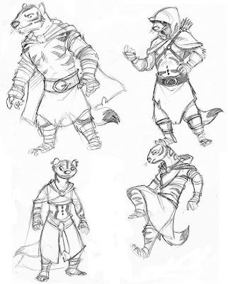
Of all the races in the comic, the Tamian have probably experienced the fewest number of changes since the original pitch went out. Instead of altering their look, we focused more on creating a cohesiveness to protagonist Quinlan's attire and trying to expand that out to other Tamian scouts. This character on the right, Miren, was meant to appear in our prequel tale as a precursor to Quinlan.

As you can see, her outfit really isn't that dissimilar to Quinlan's. The layered tunic design remains, along with the hood (which Quinlan hasn't worn up yet, but Miren does). Miren's addition to the Tamian scout uniform is the chest piece. The one here is mostly ceremonial, as a scout would not rely on it over their natural agility when it comes to defense. The chest piece would primarily be fashioned from Treewalker chitin - a symbol of that scout's first kill. Many greenhorn scouts would be shown the ropes at once, and the carapace of a giant Treewalker would be enough to fashion ceremonical chestplates for all scouts in the party.


The other race I'll show off today is the Ermehn. After losing their homeland to the Canid many years prior, the Ermehn have been relocated to the hostile Northern Wastes, forced to scavenge for food and shelter daily.

Their lifestyle and surroundings don't really allow for heavy armor or ceremonial garb, so they make do with what cloth scraps they can muster up. Instead of focusing on ornamental armor to denote their respective clans, the Ermehn rely on tattoos and paint applied to their fur, with patterns ranging from simple to complex. In most cases, the application of these marks is considered permanent. If an Ermehn is disowned by their clan, it can result in the forceful removal of these marks, which can be painful, if not deadly for the victim.


The Ermehn clothing style is similar to the one Rachel and I used in the original pitch, though the addition of heavier cloth, various wrappings, and winter cloaks all became more prominent in the recent designs. The Ermehn travel across some positively brutal terrain in the Northern Wastes, so making sure they had proper protection - even with their familiarity with cold lands - was essential this time around.

Next time I'll wrap up our tour of the comic's race updates by covering the Polcan and Canid races.

Tuesday, February 8, 2011

Brian Jacques - 1939-2011


It's not very often when somebody creates a world so imaginative, so influential, that generations of creators call on it as their inspiration. This past weekend, the creative world lost a giant - a man who crafted a world of woodland creatures living in an Abbey in the middle of Mossflower Wood, and created a community of fans and admirers that I sincerely hope will continue to be influenced by his incredible body of work for years to come.

In a world that changes on the whims of focus groups and sales charts, here was a man who honestly did not care about any of those things. The Redwall series transcended reviews and bestseller lists. The Redwall series simply was - and every year, almost like clockwork, another book came out that you could read, each one offering a simple guarantee that for a short amount of time, you would be whisked away to the world you'd been reading of since childhood, and it would always be the same, always safe, always familiar, no matter how dark or dreary the real world became.

Despite the fact that my one personal meeting with Mr. Jacques did not go very well (it involved a Redwall video game pitch back in 2004, and interviews have since proven that this was not an idea he was very keen on), I owe him so very much. To thank him for the Redwall series itself seems insignificant - instead, I look beyond it to see that Rachel and I would probably not know each other if there was no Redwall series, and this comic tale, this world, these characters - they simply would not exist without the Redwall series as a guiding light in our early years.

My long-standing and irreplaceable friendship with Sean Rubin began with that Redwall video game pitch - and other friendships I cherish (Kristen, Vero, Zach, everyone - too many to list) began with a common interest in the Redwall series. My work on David Petersen's Mouse Guard series would not have come to pass either, without the series' incredible impression on both his work, my work, Sean's work, and our friendship. Truth be told, most of my personal creative endeavors are due to Brian Jacques and the fantasy series he created.

I don't know what the future holds for the Redwall series now - but I know that regardless of what happens with the series proper, that it will continue to evolve and improve in the hearts and minds of the creators it inspired. Redwall was more than a book series to me - it was and always will be an idea; a creative spark that, as long as we continue to hold it with us, will never die.

Saturday, February 5, 2011

Updated Race Designs: Vulpin and Felis

It's been almost two weeks, time for another update!

After spending some time updating the Lutren clothing and armor and making it look more cohesive with Lutren culture, Rachel and I set about defining new looks for the other major races of the Four Kingdoms. While some things are still being tweaked, I thought I'd share some of the in-progress designs Rachel and I are examining.

For the desert-dwelling Vulpin, Rachel's first order of business was to do away with the concept of a "woodland" fox as the basis for their design, instead drawing more inspiration from the kit fox and other desert-dwelling species. The newer design sports a wider face, with eyes, nose, and mouth being relatively close together in the center, and larger ears set high up on their heads.

The end result, I think, makes them look less like a caricature of the usual fox-type characters you see these days, and helps to establish them as their own race free of the usual stereotypes one normally associates with a "fox" character.

The clothing and armor for the Vulpin pulled inspiration from a number of sources, from your prototypical Saracen warrior to the Ottomans. A number of these elements came together to form the basis of the Vulpin "look".


The other race I'll show today is the Felis - the cat-like race that hails from the kingdom of Kishar on the eastern coasts. While the Felis are celebrated explorers, scientists and navigators (natural curiosity, you see), they also have a rather impressive army, and that required some imposing armor detailing.

One thing Rachel did here that I really like is emphasize the eyes - feline eyes are very striking, and creating a helmet design that isolates them from the rest of the face makes for a very unsettling look that would strike fear into any opponent.


The armor designs take some pages from Viking designs, and have hints of the Roman Centurians as well. These will be updated to include some more interesting visual layers on the torso/legs so it's not dominated by a single texture, but overall I'm quite pleased with the first stages of this armor update.


The original Felis scholars wore robes that would have seemed at home in the Roman Senate, but the plain white just wasn't very interesting - so Rachel took a stab at a new design - one that hinted at self-importance and vanity, as these scholars think quite highly of themselves. The new design uses the Felis color scheme as well.


For reference, these are the other color schemes for the races in "Beyond the Western Deep":

Each one has their own dominant colors, so even if you don't see anything but a little blob of colors, you'll know which kingdom that blob of colors belongs to.

These new race designs are quite important right off the bat, as the comic opens on a massive cityscape, showing many races milling about the Felis city of Gair. This requires core outfit design for the various races to be solidified so we can make sure their representations in the first few panels match their appearances later on in the comic as well.

In our next couple posts, we'll go into more of the updated character designs, including those for the Tamian, Ermehn, Polcan, and Canid races.

Monday, January 24, 2011

We're Back!


Wow, it's been a long time since October, hasn't it? Actually, it's been a long time since any update on The Four Kingdoms - so I guess it's about time for some new news! Despite some definite interest in the comic pitch at NYCC last October, there haven't been any bites as of yet.

These past five or so months have been dedicated to a few different projects, ranging from a new one-sheet pitch of the comic to a possible webcomic prequel detailing the first days of the Four Kingdoms War.

After some helpful suggestions from fellow comic creators, Rachel and I have decided to begin producing our story as a webcomic series. Instead of being a prequel, however, we will be telling the story that was originally pitched, and the one that we've been detailing in this blog since the very first post. While things are still a little ways off before we can start posting material, we plan to keep what followers we have up to date on how the comic is coming along as we put the webcomic and its respective site together.

Again, sorry it's been so long since our last post - now that we're back to producing the comic, you can expect more frequent updates here - we'll shoot for one new update every 1-2 weeks with in-progress material to show off, and some in-depth stuff regarding all the changes we've made to the story over the last few months.

Click for Full-Size
What exactly are those changes, you might ask? Well, for starters, we've abandoned the 17 x 26 cm page size. For those not into the metric system, those dimensions hash out to the much more convoluted 6.625 x 10.25 inches - also known as the current "standard" American comic book size. Funny thing about standards is that people like to buck them!

After some experimentation, we've decided that the up-and-coming SQUARE format will be our modus operandi going forward. David Petersen has been a vocal proponent of the format he pioneered with Mouse Guard, and with good reason - square pages are easier to block out, easier to panel, and easier to read. And should one decide to print them out, you'll find they're easier to hold as well.

Other changes are more story-related. The script and story outline have both undergone considerable edits, though I am quite sure they are for the better. Even the characters themselves, as you can see from the concept art, have undergone some aesthetic changes based on further experimentation with the various races and their cultures.

To help illustrate just one of the more noticeable character design changes, Rachel put together this fantastic "before and after" piece to explain our creative process here:

Click for Full-Size
Perhaps the most obvious change thus far is the name. "The Four Kingdoms", while still adequately describing the continent that the story takes place in, will no longer be the name of this tale. While the name holds a special place in my heart, since it was the original name for long, it was never a particularly good name. There are simply too many "Kingdom" stories out there, and finding a good name for the comic became a long and arduous challenge. Finally, we settled on a name - one that calls up the forest that surrounds Quinlan's home city of Terria.

The new name of this story is to be "Beyond the Western Deep".

Rachel and I are very excited to be working on new content for this tale, and we hope you'll stick around for the ride as we commence full production on this new webcomic venture.

Saturday, August 7, 2010

Pitch Away!

Sorry for the long delay, folks! Truth to be told, since the pitch was completed and printed up, not a whole lot has happened on the Four Kingdoms front! After the pitch was completed, Rachel and I got the pages together and self-published a "pitch issue" to pass around to potential publishers. As we learned from the behind-the-scenes on the "Feeding Ground" pitch, having something printed up to look and feel like an actual comic is a huge advantage over a stapled bunch of 8.5x11's.

So, thanks to Comixpress, we were able to compile the pages together into our pitch issue, and it turned out perfectly! The box arrived sooner than expected, and now it's just a matter of getting it out so the right people can see it.

Chances are pretty high that we'll be hanging onto most of these suckers until New York ComicCon rolls around in October, as that will be the best opportunity to show it around to various publishers. Many a deal has been struck at NYCC, and we hope that we get that right pair of eyes on the pitch at just that right moment. As with all pitches, there is absolutely no guarantee of success, but Rachel and I are confident in the quality of The Four Kingdoms, and we hope that come October, we'll have some good news for you!

In the meantime, Rachel and I are keeping blogs outside the realm of the comic itself that focus on our individual endeavors - Rachel's blog can be found at ninjaweasels.blogspot.com, and I keep a personal blog now at alexkain.blogspot.com.